Elim Park 2020 Annual Report

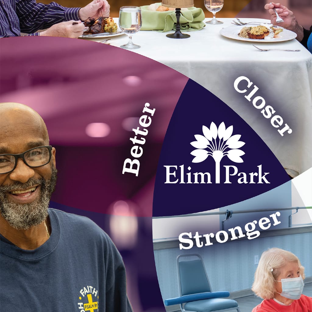
“Better. Closer. Stronger.” was the theme for this Elim Park Annual Report. Early on, the idea came to me to create three converging circles, framing imagery that represented the theme. One of those happy accidents was that the circles’ intersection is the same shape as the palm fronds on the logo. While it took more […]
Bread for Life 2020 Impact Report

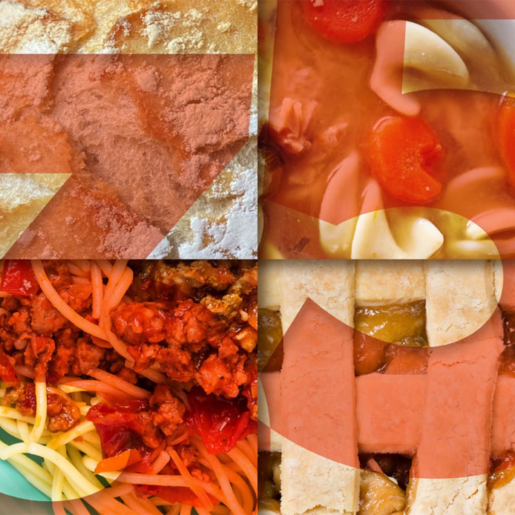
Southington Bread for Life does an extraordinary job of caring for the food insecure in our town. They faced incredible challenges in 2020, having to rethink everything they did to continue to feed the increasing number of hungry people in Southington. In designing their Impact Report for 2020, I created the theme “Bearing Fruit in […]
Elim Park 2019 Annual Report

“Welcome to What’s Next” was the theme used in all advertising and communications during 2019. Continuing with the circle elements from the 2018 report, I added arrows throughout the report to emphasize the idea of advancing. The document supports the conviction that Elim Park never rests on its past successes but believes that it must […]
Bread for Life 2019 Annual Report

Celebrating their 35th anniversary, BFL wanted to communicate, through many individual stories, the many ways they are building on a great foundation. Originally intending to print the report, it was decided that resources could be better spent on adapting to the many changes that the pandemic brought about. The finished piece was distributed to all […]
Elim Park 2018 CE&Q Report

A new CEO opened the prospect for new opportunities for Elim Park. “Vibrant” was the word I kept hearing in meetings with the marketing department. The cover carries a bold statement and rich hues, introducing the reader to a dance of circles and color, expressing enthusiasm for the future.
Elim Park 2018 Annual Report

“Don’t mess with success” would be the design theme for the 2018 Clinical Excellence and Quality Report for Elim Park Healthcare. So happy with the feedback from the 2017 report, the 2018 report became an “update” of the prior year’s chronicle. The challenge was to bring freshness to the design without simply making a duplicate. […]
Elim Park 2017 CE&Q Report

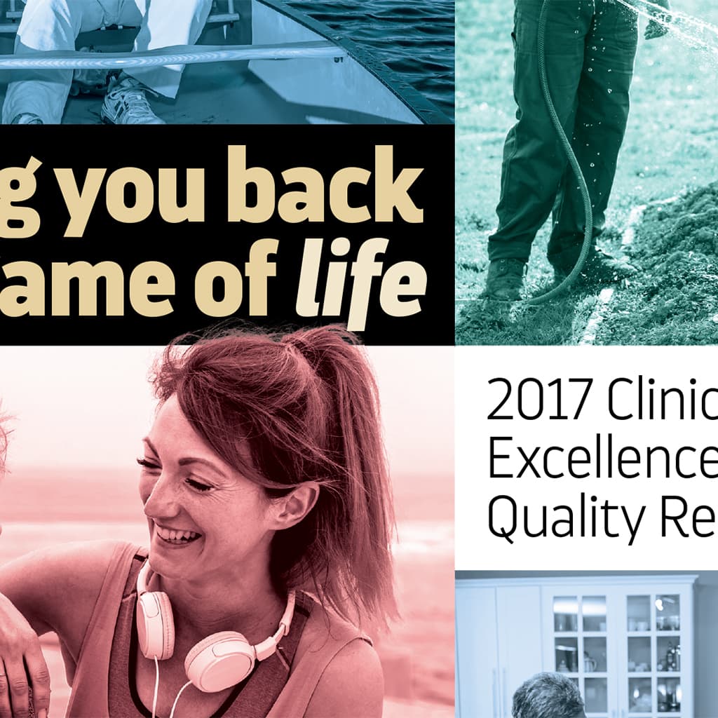
The design task was to take charts, statistics, and lists and present them in a way that was both easy to follow and a pleasant occasion for the reader. Careful use of color, bold fonts, and page breaks made it easy to find information and follow along. The client was so happy with the result […]
Elim Park 2017 Annual Report

2017 was the year for passing the baton as a new CEO would be filling the shoes of a respected and successful predecessor. Sweeping lines brought a lot of movement to the report. The cover established that life at Elim Park was not the last chapter but the beginning of a whole new story experienced […]
Klingberg Family Centers 2016 Annual Report

A rich, providential history and a strong sense of community drove the design of this annual report. To respect confidentiality, I could not use any photos of clients. Inspired by a stock photo of paper cutout people, I created my own version for the cover based on a similar figure I made for the 2015 […]
Klingberg Family Centers 2015 Annual Report

Using the Klingberg logo as the springboard for the design, the report was filled with bright colors and graphic shapes against as much white space as possible. The result was a cheerful, uplifting report that did far more than simply convey information.
